Monomyth Update - Funding, Progress, and Level Design
-
Category: News ArchiveHits: 1835
Rat Tower Software's Ultima Underworld-inspired dungeon-crawling RPG Monomyth was successfully crowdfunded earlier this year. And now, we get this Kickstarter update that briefly mentions the game's final funding numbers before taking a close look at the intricacies of non-linear level design.
Here are the text parts:
Hi, dungeon-crawling fans!
It's almost been two months since the Kickstarter so today I would like to give you a little update on the current development status of Monomyth.
Final Funding
Unfortunately, I have to start with a bit of a downer: The Kickstarter money has been transferred, however, it turned out that one major donor has dropped their pledge (8k), by not updating their credit card information. Nevertheless, the final amount (plus €950 from the Encore) is still a very good sum that can finance a good bit of contract work. The money is already allocated but I will still try to activate additional funds and patch up the hole in the original budget. Either way, it won't have an effect on the planned development, the current goal of which is content creation.
Current Progress
As you know, I have been busily designing levels over the last one and a half months. During the first month, I was still getting used to the new mode of operation but by now it's a very smooth process from concepts, to blockouts, to final results. I have had my own way of going through these steps for a while, but I also went ahead and complemented that with some reading material I had lying around for some time:[...]
Preproduction Blueprint describes a nicely structured level design process that I could easily combine with my own (which is, for all intents and purposes, a bastardization of "Feature-driven development"). I think some steps could go before others and some pages might require another read by the editor, but all in all, I feel it's a recommendable book on the subject.
At one point the author speaks of the distinction between open-world and non-linear game environments. While many games can be intuitively put into one of these two categories, the design process makes the difference obvious on a technical level. Monomyth, like its inspirations, falls into the latter category. In this update (and perhaps a few others in the future) I would like to go into detail, what that means for Monomyth's level design.
Level Design
An important consideration, that makes or breaks any non-linear environment is the overall layout of a level's individual sections. Layout affects nearly all non-visual aspects of level design, such as (felt) size, interwovenness, or flow (meaning the player's ease of navigation towards a specific goal). It further determines how well the sections of a level fit together. As a result, the level's layout simplifies or complicates the design process.
The question is, how to come up with a proper layout for your level in the first place. Generally speaking, it is advantageous to come up with the layout very early in the design process. This is, of course, a bit of a dilemma, because in the early stages of the process you do not know the look and content of the level's individual sections, which, in combination, ultimately have an impact on the final layout. So, here are two ways of tackling that problem:
a) You design the individual sections first and fit them together (bottom-up approach), or
b) you use simple geometric shapes and build an abstracted final layout, by the example of which you will design the individual sections (top-down approach).
Depending on the environment you are making, either approach may make sense. The former approach usually offers more freedom for the creation of the individual sections, but also holds the potential for what can be described as the level design equivalent of feature creep: A lot of times people (including myself) tend to try and fit too many ideas into what should be a well defined, finite task, ideally built around a single idea. The results can be incoherent section designs, especially in terms of detail and size.
The latter approach mitigates this issue, by providing geometric shapes acting as the boundaries of your sections. This gives you a rough guideline on the final section size and generally forces you to consider the realization of your ideas within a limited space. The latter of course does not stop people (again, including myself) to still try and fit as much into a level's section as possible. As a result, sections may feel cramped. In other words, something you should constantly keep in the back of your head is how to use a given space in a balanced manner.
So let us take a look at a few examples, which I do not claim to have been designed by these principles, but which seem to be in line with their core ideas. An example for the first approach is "The Lost City", the 10th Mission of Looking Glass' "Thief Gold"[...]
You can probably immediately see the individual sections, most distinctively the entrance on the left and the mage's expedition on the upper right. These are very isolated areas, with only one way in and out. There is no problem in designing, even completely implementing these sections and moving them around in the level, changing the final layout. In fact, they are so isolated, you could even take them to a completely different level (Level 4, "Down In the Bonehoard" comes to mind) and you would be fine. The same is true for many other sections of the Lost City. The tower in the center as well as the living quarters in the north are largely isolated and could be used in completely different levels.
So, at least in theory, this level could be designed in a largely bottom-up approach, where you create the sections first and fit them together in a hopefully advantageous way. The long hallways connecting the individual sections seem to indicate something like that may have even happened, though they may also be attributed to the initial idea of the level, which is a long-winded, maze-like ruin of an ancient civilization. These hallways also highlight one of the problems of the approach and one of the issues a lot of people seemed to have with this mission: It's a bit of a slog.
In contrast, I would like to draw your attention to Thief's first level, "Lord Bafford's Manor", where the individual sections are significantly stronger interwoven and more simple in shape. Obviously, this is due to the fact that most of the level is set in a realistic, largely symmetric building which gives us a hint, when to use which approach. Either way, the level is still sectioned and this becomes very clear when we take a look at the map[...]
The manor itself can roughly be separated into five sections: The basement, the back (kitchen), the middle (pool and hallways on two levels), the front (guard rooms and gate), and the throne room plus its neighboring rooms. We can identify these sections by looking at how they connect to each other and how the player progresses through them. Generally, the progression goes "Basement -> Back -> Middle -> Throne Room -> Middle" and then the player escapes through the side gate in the north. The front is mostly irrelevant and deadly due to all the guards. The middle connects to all parts of the manor, except the basement, which also makes it the part of the level you navigate through most of the time. This type of section could be called a "connector".
Going with a top-down approach, a series of geometric shapes can be fit around such a connector and create an abstracted final layout which is then filled in. In the map above these shapes are simple rectangles, but of course you could always go with something more complex. Since the second floor introduces the z-axis to the design one may want to use a 3D tool during the layout phase[...]
Now, this is how Thief does it, but we can also see a similar approach in Ultima Underworld, an earlier Looking Glass game and one of Monomyth's main inspirations. As one of the most obvious examples, we can refer to Level 2 of the Stygian Abyss[...]
The level consists of four sections built around a cross-shaped connector. Despite its simplicity, this is an excellent way of structuring the level. There are four thematically different sections, each of which are largely built around a single idea (the blueprint quest, the marble room, the mountain folk, and the monster quest). Thanks to the connector every part of the level can be reached relatively quickly and the player can concentrate on the actual challenges (which is not to say, that exploration can not be a challenge in itself - and a quite entertaining one if there is verticality involved).
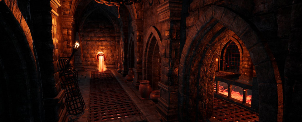
So, how are these principles applied to Monomyth? The project mostly relies on a top-down approach. You could already see this in the Serpent's Bastion, the level you explored in the Kickstarter demo[...]
The valley, as well as the adjacent entrance areas at both ends (including the tower), act as a connector between the lower bastion, the caves, the trading house, and the castle. In each of these sections, you will find one of the seals necessary to open the magic gate and finish the demo. The usual progression goes in the order mentioned before, however, there is technically no problem in lockpicking the tower, entering the castle, and progressing through the level in the opposite direction. It has to be added, that this level is meant as a tutorial and therefore, deliberately designed with a more linear flow in mind. By locking the tower, players are more likely to first go through the lower bastion and continue with the caves. The connector sections of later levels in the game are generally more open[...]
So, with a little bit of abstraction as well as a good layout the design and creation of levels can become a smooth and fun process. How to go about it naturally depends on the actual environment, but it is probably a good idea to keep a well-structured method in the back of your head.
Next time we will take a look at section design, where the rubber really hits the road! Until then!
Michael