Lords of the Fallen Post-Mortem
-
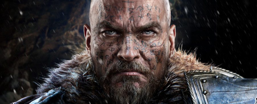
Category: News ArchiveHits: 1952
Gamasutra has published a Lords of the Fallen post-mortem penned by director Jan Klose and technical director Thorsten Lange, which candidly goes over what went right and wrong during the development of the title. It's an interesting read and should help fans fill the time as they wait for a release date announcement for the Ancient Labyrinth DLC.
A snippet on what went right:
1. Finding the core game loop early
Creating the first concepts for a brand new IP is both challenging and thrilling at the same time. At the beginning of the production, we already had a concept in place that was not too far away from Venetica, our first RPG. In open talks with the publisher CI Games about what was possible, time- and budget-wise (and what wasn't), we soon decided that we better not try to do too much at once, but rather focus on one core gameplay element and build the game around it. During conception, this proved rather tricky for a game in the RPG genre, because people generally expect a host of features that turn their game into an alternative world, a world in which everything is possible.
Our debut RPG project Venetica already featured tactical close combat, but all in all, Venetica was more focused on story and a unique atmosphere. The combat, while being a good start and a valid source of inspiration, was not really the game's focus. But it was an element that had been much fun to develop, and we wanted to build up on that. So should tactical combat be the foundation of Lords of the Fallen?
Luckily we shared a vision with producer Tomasz Gop: our passion for Demon's Souls. Above all, this game taught us one thing: You can build a game around a hard and challenging combat system and, at least after people embraced Demon's Souls, you wouldn't need to boil the project down to some convenient cutscene-packed game that would almost play itself. After Demon's Souls, you were able advertise your game as hard and challenging again, a thing almost all people at Deck13 had grown up with and missed in many games that had recently been released.
So we agreed with Tomasz that the tactical action combat should become the one core element of the game, that we would start with it and build everything else around it. Even the story, a component that we at Deck13 are kind of known for, was not supposed to play the major role, however we still planned to make it strong and compelling too (a thing that we should only partially succeed with).
Our experience with a similar combat system and our love for Demon's Souls resulted in a very clear game mechanic that we kept until the end, even though some people later said it really played quite a lot like Demon's Souls successor, Dark Souls. Some even called us a Dark Souls clone. While this certainly felt a bit unfair, the good thing about it was that people were desperately waiting for Dark Souls to appear on the new generation of consoles, but it didn't, so we were able to fill that gap (and certainly many players did consider our game to be quite different to Dark Souls when they actually played it!). Also, we considered our combat mechanics to be quite similar to Dark Souls mainly because they both tried to convey a very timing-focused combat. And we were not fond of making our system less focused on timing just because another game had just excelled in this area.
In any case, the tactical combat worked very well, and it was the one element that kept the game and its development together from start to finish.
And one on what went wrong:
4. Art-driven design approach
Having no proper management structure in place also meant that the people and departments with the strongest standing were those who dominated parts of the design process. This tended to make things rather difficult, especially when detailed art design decisions were made by top management without considering the whole pipeline, giving tech and game design personnel a hard time.
After finishing Venetica, we were determined to make the areas work together better. However, at times it felt like we were doing even worse than before.
At the start of the production, technicians were clever enough to set up strict asset limits based on their best estimates. This was supposed to ensure that the artists would not create assets with an insane amount of polygons or use a crazy amount of material layers, slowing the engine down to a point where even technical optimization would not be able to save the day. During preproduction, however, these limits were largely ignored with the argument that we would "first need to find the right look" and that we would be able to "boil the whole thing down later anyway." But it turns out that if you show people a scene full of great stuff, they will not want to go back to scenes that look more scarce, whatever argument of reason you might offer them (like "framerate"). Then it was all coming back to the tech guys who, obviously, had told everyone that it would end up like this and nobody listened to them. Believe it or not, the tech people always seem to be right in the end, so next time it would be wise for us to listen to them right from the beginning, even if that might mean hard fights with management, marketing, or other publishing departments.
The game designers, on the other hand, were facing a different kind of problem. At Deck13, game designers usually create 2D maps of their levels, offer them to the art department where a 3D world (the blocked-out level) is created out of that, and that goes back to the game designers to put in their gameplay assets using our Fledge Editor and test the gameplay flow, and then it goes once again back to the art department, who will improve the level structure and add details with whitebox geometry. This is a tricky process because these two departments need to talk to each other after every step they take, and in the heat of the battle this might slip from time to time. Things get even harder when 3D models of game levels surprisingly come floating in from the publisher, suggesting some "cool structure" here and some "awesome new castle" there. If you have ever tried to cram gameplay into an existing map that has been created by artists that were working without the guidelines in mind, you will agree that this feels like quite the wrong way around, especially if your team is considerably larger than a couple of people.
Enemy design was another critical topic. Several experienced people in the art and game design departments had a pretty clear picture about the rules we needed to apply to make the enemies work well in our game: As it was so crucial for the player to quickly identify the type of opponent he would be facing (to brace himself with the right equipment and tactics), we needed them to be clearly distinguishable in size, color, and movement (see Left 4 Dead as a great example on how to do it right). However, there was a design guideline installed that said that all enemies were required to look like "honorable warriors with human shape." This, however, resulted in all enemies looking pretty much alike when you actually played the game, making it very hard for the player to identify who he was fighting against. Luckily, external feedback was finally gathered, the guidelines were changed, and we created as much enemy variety as time still allowed. Again, we could have achieved this more cheaply.
The art-driven design approach resulted in being over-budget with our assets, and with the stuff being rendered on screen at once. It again meant that we could not fulfill our production sprints because nobody could actually integrate everything that they would have needed to.